


Fonts & Stylish Text Bio
4.61.00 Reviews
App Specs
- Version
- 1.0.2
- Updated On
- License
- Free
- Downloads
- 10,000+
- Developer
- Stay Strong
- Categories
- Personalization
- Platform
- Android
Screenshots
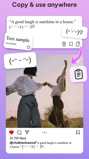
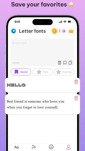
 Analysis by AppCompare
I tried Fonts & Stylish Text Bio as a practical personalization tool rather than treating it as just another collection of decorative letters. Its main appeal is simple: it gives you a way to make short pieces of writing look more distinctive when the standard keyboard feels too plain. That can mean a profile bio, a nickname, a caption, or a small message where visual style matters as much as the words.
The app is free to start, and it is aimed at an Everyone audience. It comes from Stay Strong and currently sits at version 1.0.2, so I approached it as a relatively young app rather than a mature utility with years of refinement behind it. My overall impression is positive, especially for people who regularly adjust their social profiles or want a quick way to experiment with text styles. At the same time, it is most useful when you understand the limits of decorative text before making it part of an important username or bio.
How Fonts & Stylish Text Bio feels in everyday use
I find the app most useful when someone in the household wants to dress up a short bio or nickname without changing the phone’s everyday keyboard. In the next section, I’ll look at how to keep that small creative task separate from shared-device routines, so a bit of personalization does not become a source of confusion.
A quick way to make ordinary text more personal
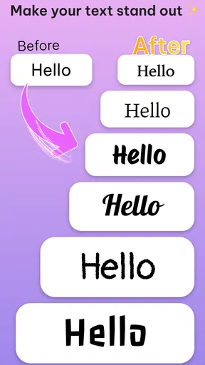
The strongest part of the experience is the low commitment. You do not need to redesign an entire profile or learn a complicated editing system. The idea is to enter or prepare a short phrase, browse a more expressive treatment, and use the result where you need it. That makes the app especially suitable for short-form writing, where a few unusual characters can change the mood of a profile without adding extra words.
I found that this approach works best for names, short bios, status lines, and playful captions. A nickname can feel more individual with a small visual twist, while a bio can gain a clearer personality when its headings or separators look different from the default keyboard output. The benefit is not that the app creates better writing; it helps the writing look more intentional.
That distinction matters. If you are searching for a full graphic-design editor, this is not the right kind of tool. Its value is in text styling and quick personalization, not in building posters, editing photographs, or arranging complex layouts. I would use it alongside a social app, messaging app, or profile editor, rather than expecting it to replace one.
Where it fits better than the usual alternatives
The usual alternative is to copy decorative characters from random websites, save them in a notes app, or rely on whatever special characters the phone keyboard happens to offer. Fonts & Stylish Text Bio is more convenient for someone who wants a dedicated place to explore styles instead of searching the web every time. Keeping the workflow focused on short text also makes it easier to test several looks before choosing one.
Worth Reading Before You Choose

EA SPORTS FC Mobile 26 Is a Bigger Football Game, but It Takes Time

Flipboard Shows What News Apps Must Do Beyond the Feed

Switching to Android Auto Means Rethinking Your Driving Routine

Google Calendar Makes a Crowded Week Easier to Manage

Ludo King Makes the Most of the Minutes Between Plans

Baby Panda World Brings Quick Play to Modern Phones, but Its Game Library Feels Busy
Compared with a full font-changing keyboard, a focused text-style app can be less intrusive. You can prepare a phrase when needed instead of changing the keyboard you use for every conversation. That is a meaningful advantage if you want occasional decoration but still prefer a normal keyboard for everyday typing.
There is also a trade-off. A keyboard-based alternative may be faster when you are constantly styling messages inside different apps. Fonts & Stylish Text Bio makes more sense when you care about selecting and preparing a finished phrase, particularly a bio or nickname, rather than decorating every sentence as you type.
A realistic profile-editing workflow
Imagine updating a gaming profile before joining a new group. I would first write the name and short description in plain text, because the wording should remain readable before any decoration is added. Then I would try a restrained style for the name, keep the explanatory part of the bio simpler, and paste the result into the profile editor. After saving, I would check the profile from another screen or ask a friend whether the characters display correctly.
That last step is easy to overlook. Decorative text often depends on character support in the destination app, the phone, and the viewer’s device. A style that looks polished in the generator can appear uneven, show substitute symbols, or become difficult to read elsewhere. My practical advice is to treat the app as a design preview, not as a guarantee that every platform will render the result exactly as intended.
A second useful workflow is to create two versions of the same bio: one expressive version for a social profile and one plain-text backup. The plain version is valuable if a platform rejects unusual characters, trims the text, or makes the profile harder to search. This small habit avoids having to reconstruct your wording later.
The less obvious value of restraint
The tempting part of stylish text is trying every eye-catching option at once. In my experience, that usually makes a bio harder to scan. The better use is selective emphasis: style the name, a short heading, or one key phrase, then leave the rest conventional. This gives the decoration a purpose instead of turning the whole profile into visual noise.
Another practical tip is to test text length after styling. Special characters can behave differently from ordinary letters, and a line that looks short in the editor may occupy more space or be counted differently by the destination service. If a profile has a tight character limit, prepare a shorter plain-text draft first and only then apply the visual treatment.
I also recommend avoiding decorative styles for information people must copy accurately, such as contact details, directions, handles, or instructions. Stylish characters can be attractive but may slow down reading and make manual copying frustrating. The app is at its best when appearance is the goal, not when clarity and accessibility are the only priorities.
What the current release tells me
The current version, 1.0.2, suggests an early stage of the product’s development. I see that as both an opportunity and a reason to keep expectations realistic. An early release can feel focused because it does not try to become an entire design suite, but it may also leave room for smoother organization, broader compatibility, and more polished handling of edge cases.
The app was released on April 22, 2026, and its visible audience is still modest, with over ten thousand installs and a 4.6 average from around six hundred ratings. Those figures indicate encouraging initial interest, but they do not establish the same long-term track record as a heavily established personalization tool. I would be comfortable trying it for casual profile decoration, while taking a little more care before depending on it for a large collection of important saved text.
Its free entry point is helpful because the basic decision is easy: install it, test the workflow, and decide whether the available styling is useful to you. There are in-app purchases ranging from ten cents to ten dollars per item, so I would check the purchase prompt carefully before confirming anything. The free starting point lowers the barrier, but it does not mean every possible item or option necessarily follows the same cost model.
How the update affects existing users
For someone already using the app, version 1.0.2 is best viewed as the current baseline rather than proof of a major transformation. I would update before judging the experience, then pay attention to the details that matter in real use: how quickly a phrase can be prepared, whether copying feels dependable, and whether the chosen characters survive the trip into the target app.
Existing users should also keep their own small library of successful phrases outside the app. A notes document containing a plain version and a styled version gives you control if you change phones, edit a profile repeatedly, or discover that a particular service does not display one style correctly. This is not a criticism of Stay Strong; it is simply a sensible backup strategy for any tool built around copied text.
The developer’s early product direction appears clear from the app’s focus: personalization through fonts, stylish text, bios, and nicknames. I would rather see that core workflow become reliable than see the app expand too quickly into unrelated editing features. For current users, a narrow tool that is predictable is more valuable than a crowded interface full of options they rarely use.
Where I still notice friction
The biggest limitation is the gap between visual novelty and universal readability. Some styles are fun for a display name but tiring in a paragraph. Others may be difficult for screen readers, search tools, or people using different devices. If your profile needs to be found easily, or if you communicate with a broad audience, plain text may be the more considerate choice.
Platform restrictions are another important consideration. Social networks and games may limit unusual characters, normalize them, reject them, or display them inconsistently. That means the app cannot control the final result once you leave it. I would never change a carefully established username without first testing the exact text in the destination service.
The purchase structure may also require attention from families. The app is rated for Everyone, but optional items can cost between ten cents and ten dollars each. The age rating describes suitability; it is not a substitute for checking purchase controls on the device. If a child uses the app, I would review the device’s purchase settings before handing it over.
Finally, people who need professional typography may find the concept too limited. A brand identity, business announcement, or accessibility-sensitive publication usually needs control over spacing, hierarchy, and consistent rendering. A text-style app can help with a casual accent, but it should not be the only tool in a serious publishing workflow.
Who should use it, and who should skip it
I would recommend Fonts & Stylish Text Bio to anyone who frequently refreshes social bios, enjoys experimenting with nicknames, or wants a quick alternative to plain keyboard text. It is particularly appealing if you prefer preparing a finished phrase separately instead of installing a replacement keyboard and changing your entire typing routine.
It is also a good fit for casual creators who want a small visual signature in captions or profile sections without opening a full design application. The free starting point makes experimentation straightforward, and the focused purpose keeps the learning curve gentle.
I would skip it if you need a complete font manager, a professional layout editor, or guaranteed identical rendering across platforms. I would also avoid relying on it for text that must be searchable, copied perfectly, or read quickly by everyone. In those situations, a normal keyboard, a notes workflow, or a full design tool is likely the safer choice.
What I would watch as the app develops
Because this is an early product, I would watch for improvements in organization and compatibility rather than simply more decorative choices. The most useful progress would be making it easier to compare styles, preserve readable versions, and understand how text may behave after it is pasted elsewhere. Those changes would improve the everyday workflow without changing the app’s basic identity.
I would also pay attention to how Stay Strong handles the balance between free use and optional purchases. A clear separation between immediately useful styling and paid extras helps users decide confidently. Since individual in-app items can range from a very small charge to ten dollars, transparency around what each purchase adds will matter to the app’s long-term trust.
Another sign of healthy evolution would be better support for practical scenarios rather than decoration alone. For example, users benefit from being reminded to keep a plain-text backup, from seeing a preview that emphasizes readability, and from having an easy way to reuse a successful phrase. These are small details, but they address the real problems that appear after the initial excitement of trying new styles.
My verdict after using it
Fonts & Stylish Text Bio is a useful, focused personalization app when you want short text to feel less ordinary. I like its straightforward purpose and the way it fits between a basic keyboard and a full design editor. It gives profile owners, nickname collectors, and casual social users a quick way to explore a more distinctive look without committing to a completely different typing setup.
My recommendation comes with one rule: use style as an accent, not as a substitute for clear writing. Prepare the wording first, test the result where it will appear, and keep a plain version for important profiles. If you follow that approach, the app’s current release is easy to try and capable of adding personality in the places where a little visual difference goes a long way.
Pros
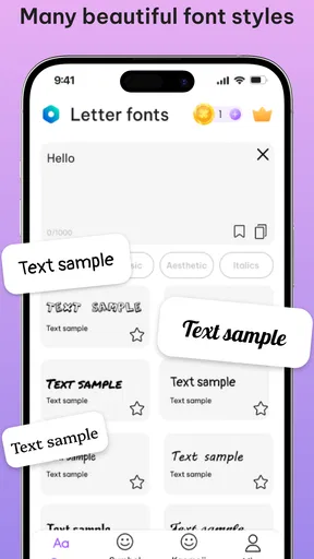
- Offers many decorative fonts for bios
- captions
- and messages.
- Text previews make it easy to compare styles before copying.
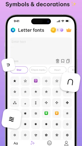
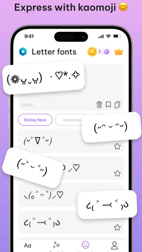
- Includes symbols and emojis for more creative profile designs.
- Copy-and-paste workflow is quick and convenient.
- Works well for users without design or typography experience.
Cons
- Some fonts may not display correctly on older devices.
- Certain styles can be difficult to read in longer messages.
- The most attractive options may require watching ads or upgrading.
- Copied text may look different across social media platforms.
- Frequent font choices can make profiles appear cluttered or generic.
FAQs for Fonts & Stylish Text Bio
What is Fonts & Stylish Text Bio used for?
Fonts & Stylish Text Bio is designed to help you create more distinctive text for social media profiles, captions, messages, comments, and bios. It offers collections of decorative fonts, symbols, emojis, and text styles that can be copied and pasted into compatible apps. The main purpose is personalization, allowing ordinary text to look more creative without requiring graphic design skills.
How do I use the fonts and stylish text in other apps?
After choosing a style in Fonts & Stylish Text Bio, you generally type or paste your message, select the desired font or decoration, and use the copy button. You can then open Instagram, TikTok, WhatsApp, Facebook, or another supported app and paste the result into a bio, post, message, or comment. The exact appearance may vary depending on the receiving app and device.
Are all fonts and symbols supported on Android and iOS?
Not every font or symbol will display identically on every phone. Many styles are created with Unicode characters rather than traditional installed fonts, so compatibility depends on the operating system, the destination app, and the recipient’s device. Some characters may appear as empty boxes, unusual symbols, or standard text. Testing a style before publishing is recommended.
Is Fonts & Stylish Text Bio free to download and use?
The app may provide free access to a selection of fonts, symbols, and text tools, while additional styles or features can depend on the version installed. Users should review the current Google Play or App Store listing for subscription details, advertising information, and possible in-app purchases. Checking these terms before downloading helps avoid unexpected charges or limitations.
Does Fonts & Stylish Text Bio require an internet connection or special permissions?
Basic text generation and copying may work without a continuous internet connection, although advertisements, updates, analytics, or online content can require access to the network. The app should not normally need extensive permissions simply to create stylish text. Before installation, review the permissions shown in the official store and avoid granting access that does not appear necessary for its features.


